Costa Rica Treatment Center
A bilingual redesign that helps families choose treatment with clarity and confidence.
Client Challenge
Costa Rica Treatment Center helps people from around the world recover from addiction, which means most visitors are families weighing whether to send someone they love to another country. The site they landed on made that harder than it needed to be. The same programs were spread across three separate sections, the treatment approach sat several levels deep under the physical locations, and everything that might earn a family's trust was scattered across the site. The information was all there. The way it was organized worked against the family trying to use it.
Our strategic approach
Before we designed a single page, we ran a five-session audit of the whole site. It told us the real problem wasn't how the site looked, it was how it was organized: arranged the way the business thinks about itself rather than the way a family reads.
So we changed the organizing principle. We mapped the site to the questions a family asks, in the order they ask them. What do you treat? How do you treat it? Where does it happen? How do I start? Nothing a family needs now sits more than two clicks from the homepage.
Solution
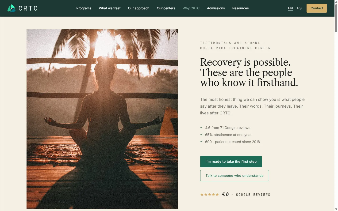
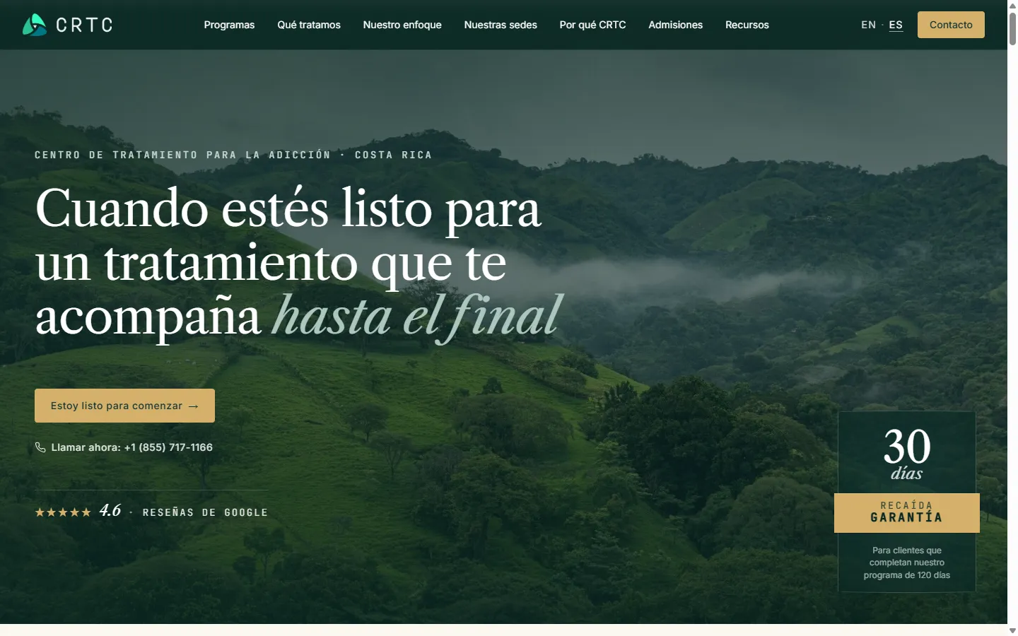
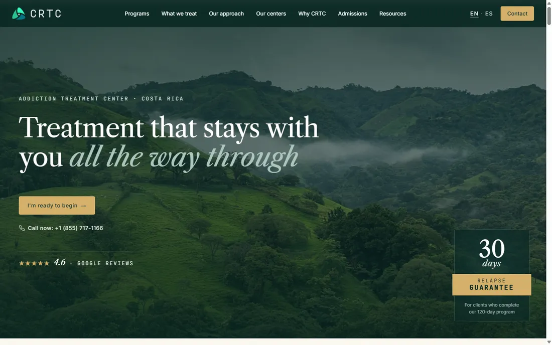
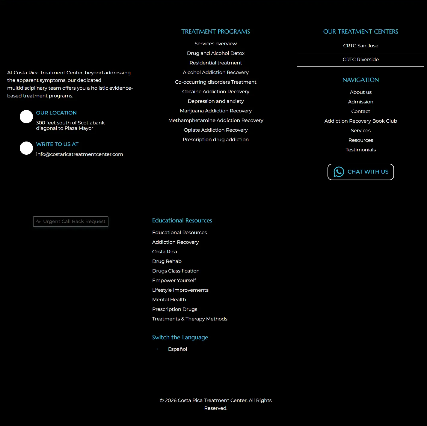
We rebuilt the site around those questions. Three overlapping sections became one clear story about how the center treats people. Every program page now carries its own pricing and a clear next step, so the path from "I'm interested" to "I called" holds all the way through. And the case for trusting the center, the founders, the clinical team, the accreditations, the testimonials, the track record, now lives in one place that builds confidence as you read.
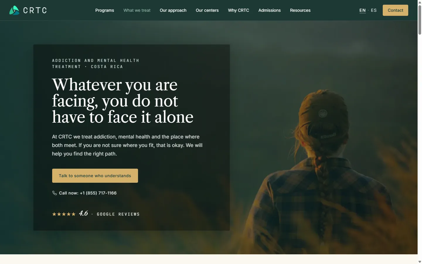
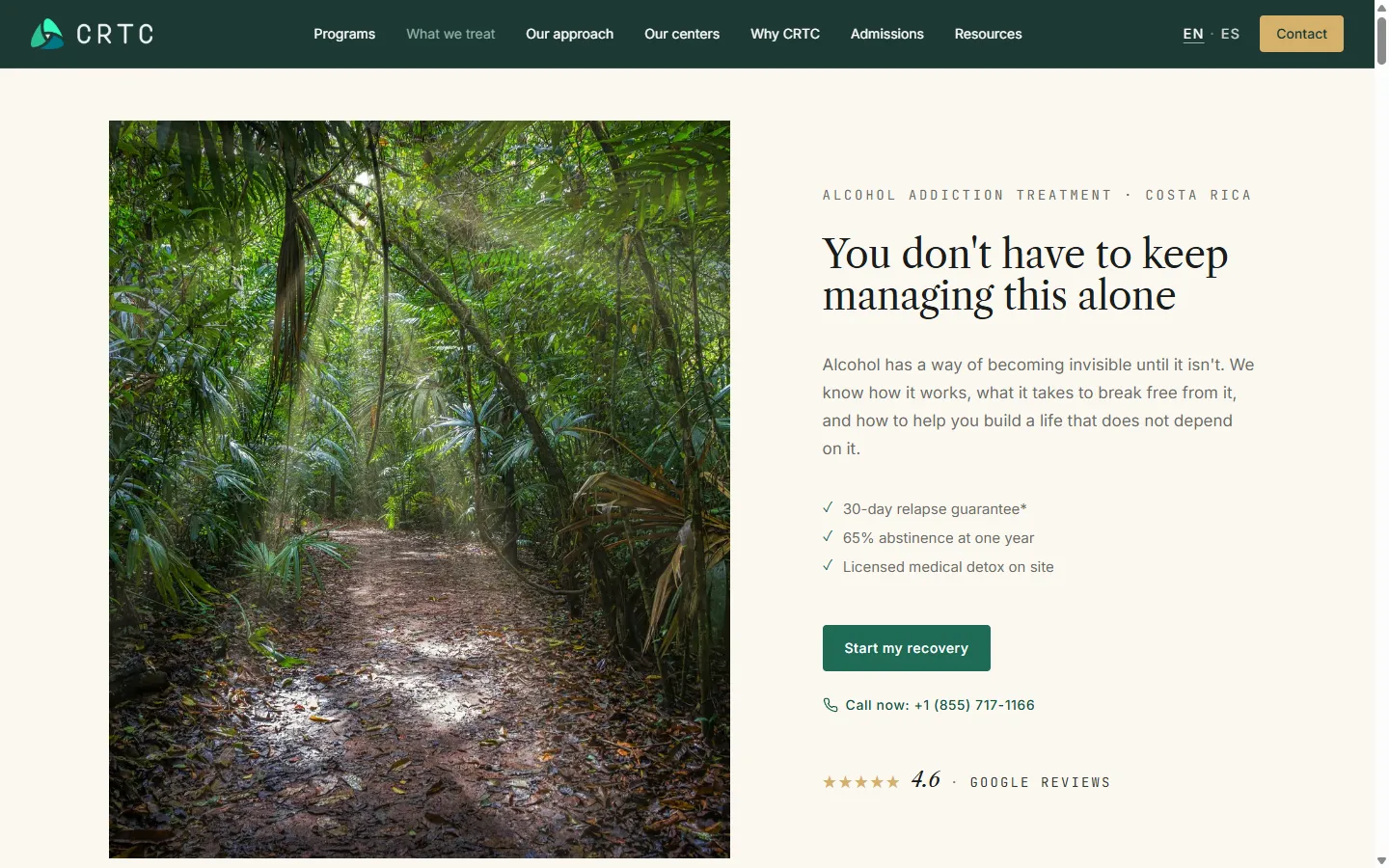
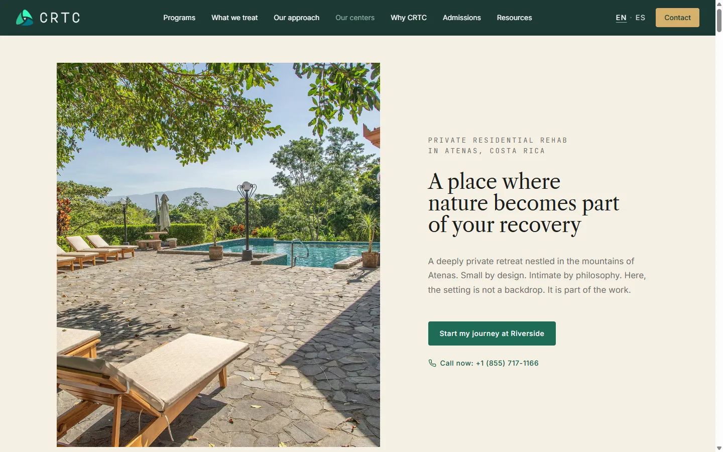
The redesign also changed how the site feels. The old one was clean and professional but cool, closer to a hospital than a place you would want to recover. We kept the clinical credibility and added the warmth and sense of place it was missing. The brand's blue-teal stepped back and forest green moved to the front, so the palette belongs to the Costa Rican landscape rather than a clinic. The photography took an editorial, nature-forward direction that treats the setting as part of the treatment, not as decoration. A warm serif carries the feeling and a clean sans carries the information, so the clinical details never read cold. English and Spanish were built as equals throughout.
The client came to us asking for WordPress. We recommended against it. The stack we proposed instead, Astro and Sanity, was the better fit for a site that has to stay fast and dependable while families read it at all hours: pages that load quickly and stay that way, content the team can update without touching code, and none of the plugin upkeep, bloat, or security holes that a WordPress site tends to collect over time. Making that case, instead of just taking the order, is part of what won us the project.
Results
Families now meet a site that answers their questions in the order they ask them, in whichever language they speak, with a clear next step on every page. And the track record the old site never managed to state plainly now leads: a 4.6 Google rating across more than 70 reviews, over 600 patients treated, and a decade of care in Costa Rica.