Michelle Pauly
An architectural designer's portfolio rebuilt for a new stage in her career.
Client challenge
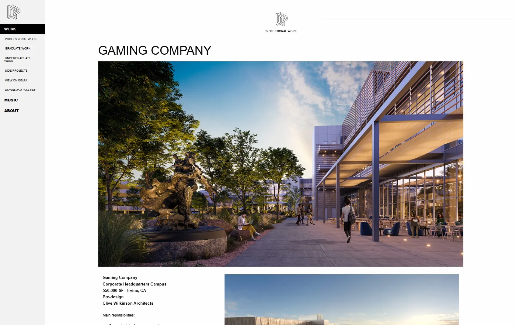
Michelle Pauly is an architectural designer in Los Angeles. Her old portfolio was a static site she had no way of updating herself, so it had sat untouched for years and still showed the career she had when it launched. Everything ran down one very long scrolling page: her professional projects, her graduate work and her undergraduate work.
The page also never said what her role on each project had been, which matters most on the professional work, where the buildings belong to the firms she worked at. A firm looking at her portfolio wants to know what she can do and which parts of the work were hers.
Our strategic approach
The site had to show where she is now, leading with her professional work. The academic projects were removed. The professional work stayed and got built out, from the five projects the old site listed to ten across residential and commercial.
We went through current architecture portfolios together before drawing anything and took the structure from them. The professional work also had to name her, not just the buildings.
She also had to be able to keep the site current herself, without a developer in the loop.
Solution
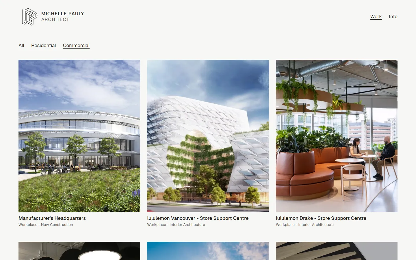
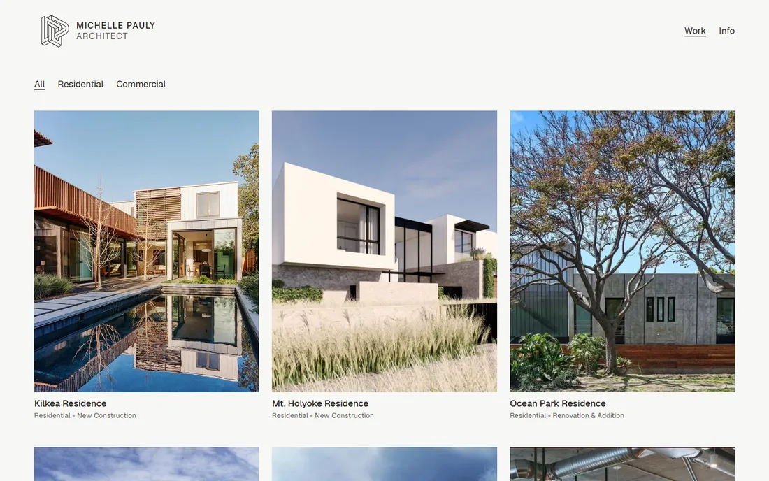
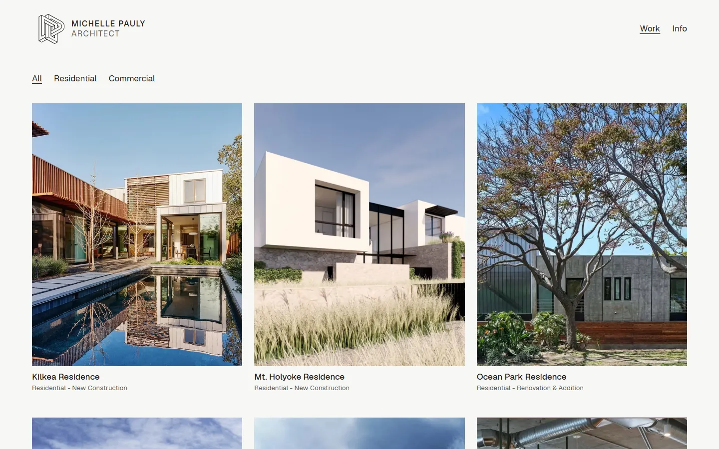
The homepage is the work itself: a grid of every project under a category filter (All, Residential, Commercial).
The grid is uniform. Every project sits in the same 4:5 portrait crop, with its name and a type line underneath, always visible. Nothing is held back behind a hover, so the grid reads the same on a laptop and on a phone.
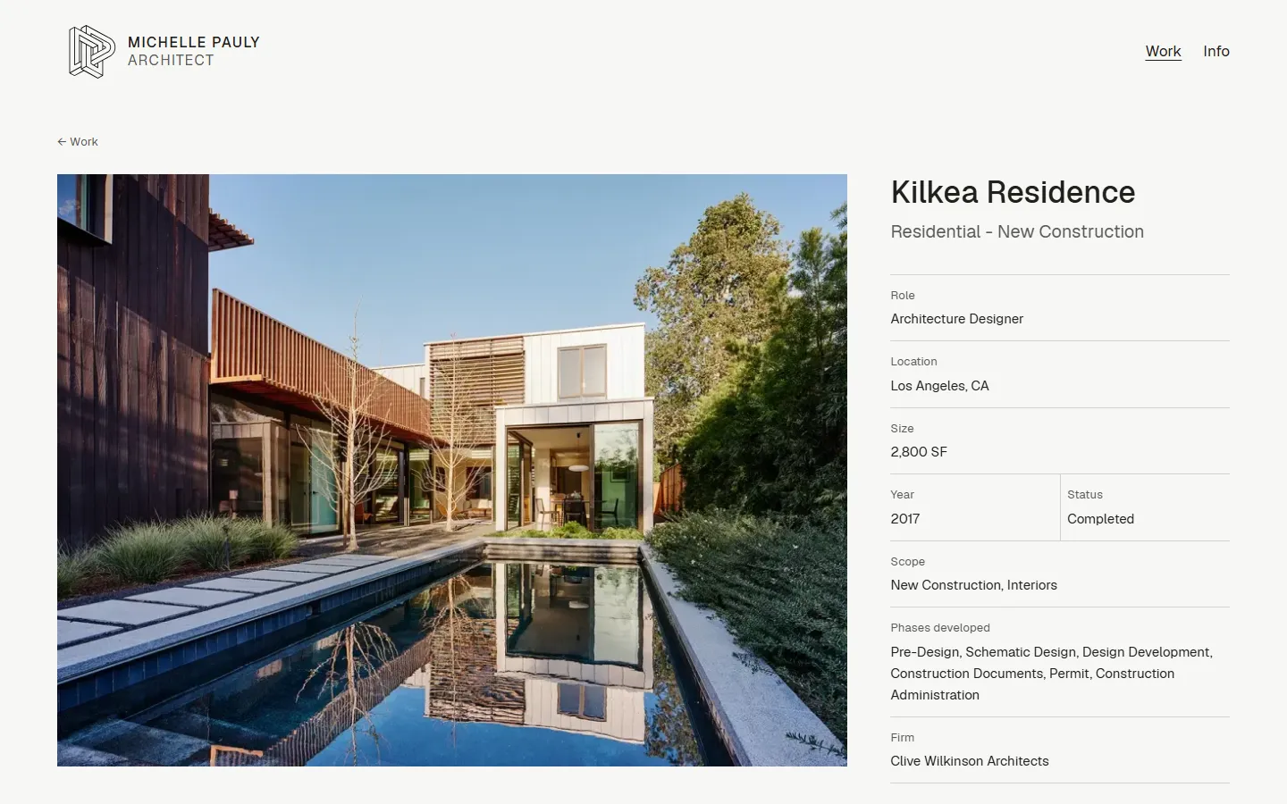
Each project page sets a block beside the lead image: her role, the firm, the phases she carried and the scope. A firm reads what she did and sees the project at the same time.
We set the ground as a warm off-white rather than pure white. It keeps the page from glaring around the images, and it reads as a little more elevated while staying clean and bright.
Every project, category and image is a document she edits in Sanity. She got the hang of it immediately and had her most recent work in and published on her own.