Templeton Living
A new design system, carried from a print brochure onto the website, for a Passive House development in East Vancouver.
Client Challenge
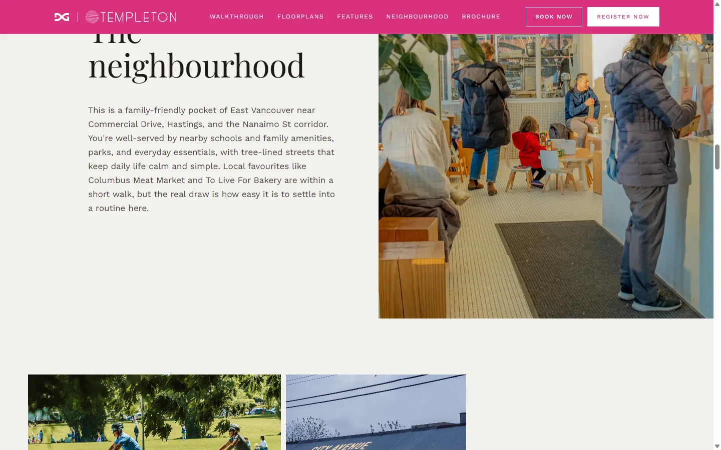
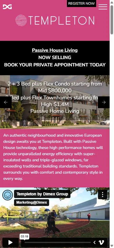
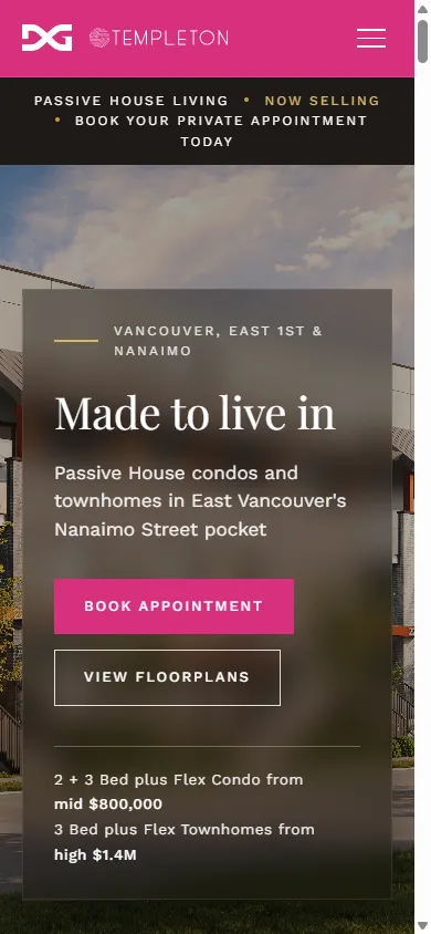
Templeton is a Passive House development by Dimex Group, a Vancouver builder of more than thirty years, set in the Nanaimo Street pocket of East Vancouver. The homes are carefully engineered and quietly premium. The website selling them was neither. The existing one-pager held all the right information, the floor plans, the Passive House story, the neighbourhood, but it stacked everything into dense blocks of centered text laid over photos, with competing buttons and no clear path to the one thing that matters: booking an appointment. On a phone it was worse, the hero text crowding over the image until it was hard to read at all. For a buyer weighing close to a million dollars, the site undersold the product.
Our strategic approach
Dimex needed a sales brochure for Templeton, and the website selling the homes wasn't doing them justice either. Instead of treating those as two separate jobs, we built one design system to carry both: a quieter, more confident language of type, spacing, and layout, working within the existing brand rather than replacing it. We designed the brochure on it first, then carried the same system onto the website.
Solution
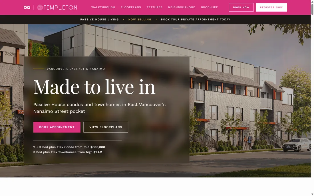
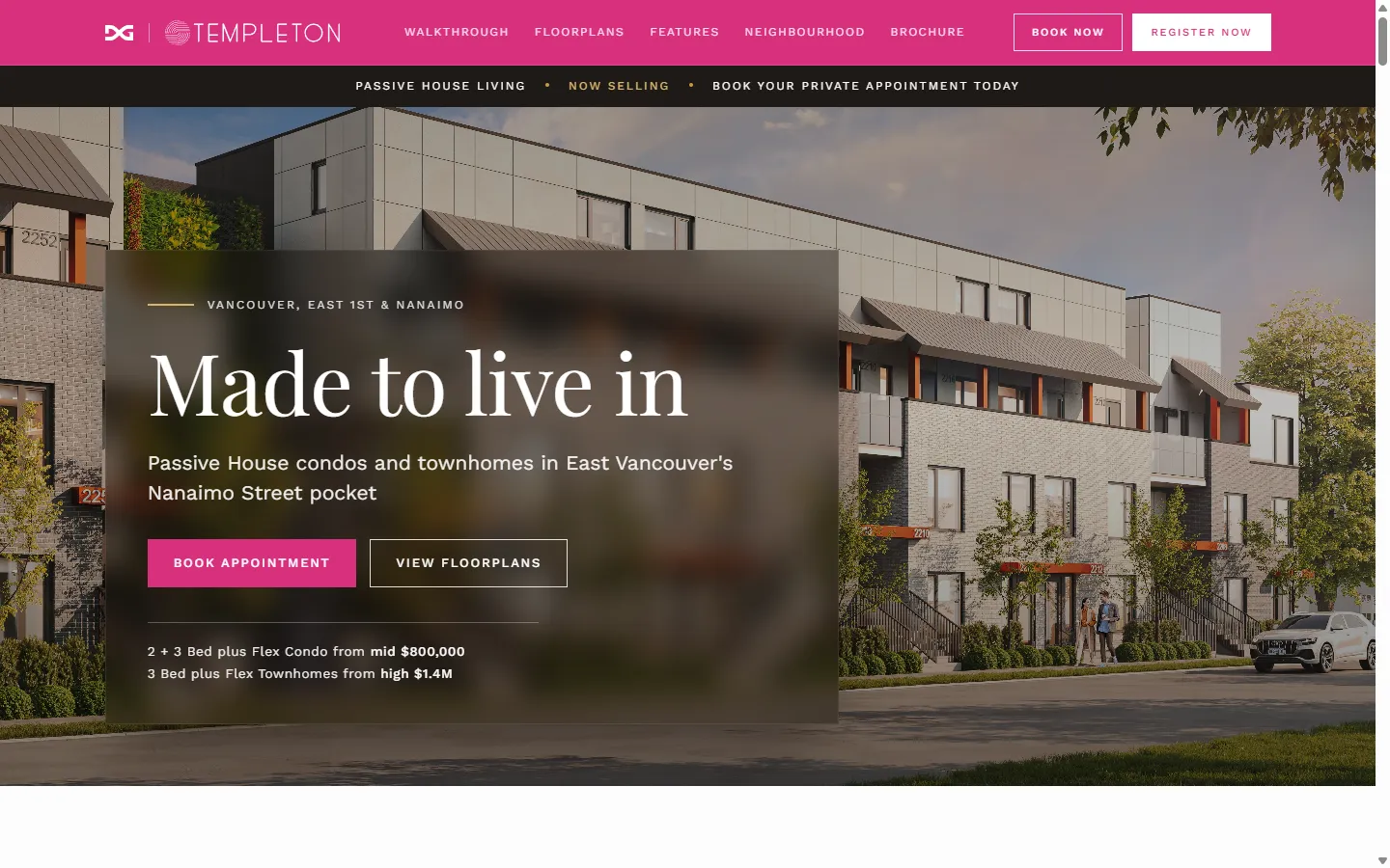
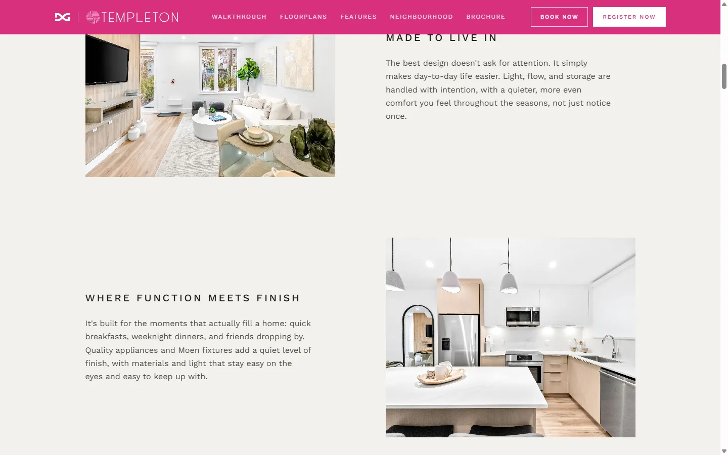
We rebuilt the one-pager around that system. A display serif now carries a short, human headline, "Made to live in," where the old site had stacked sales copy. The spacing opened up, and the two actions that matter to a buyer, book an appointment and view the floor plans, became the clearest things on the page. Everything the old site buried is still here, but it reads in order now: the homes, the finishes, the walkthrough, the neighbourhood, the Passive House engineering, the plans.
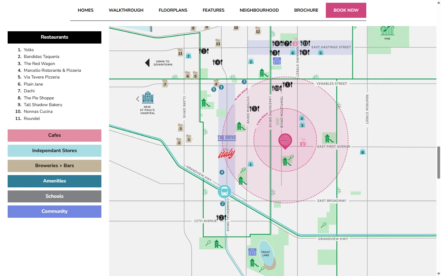
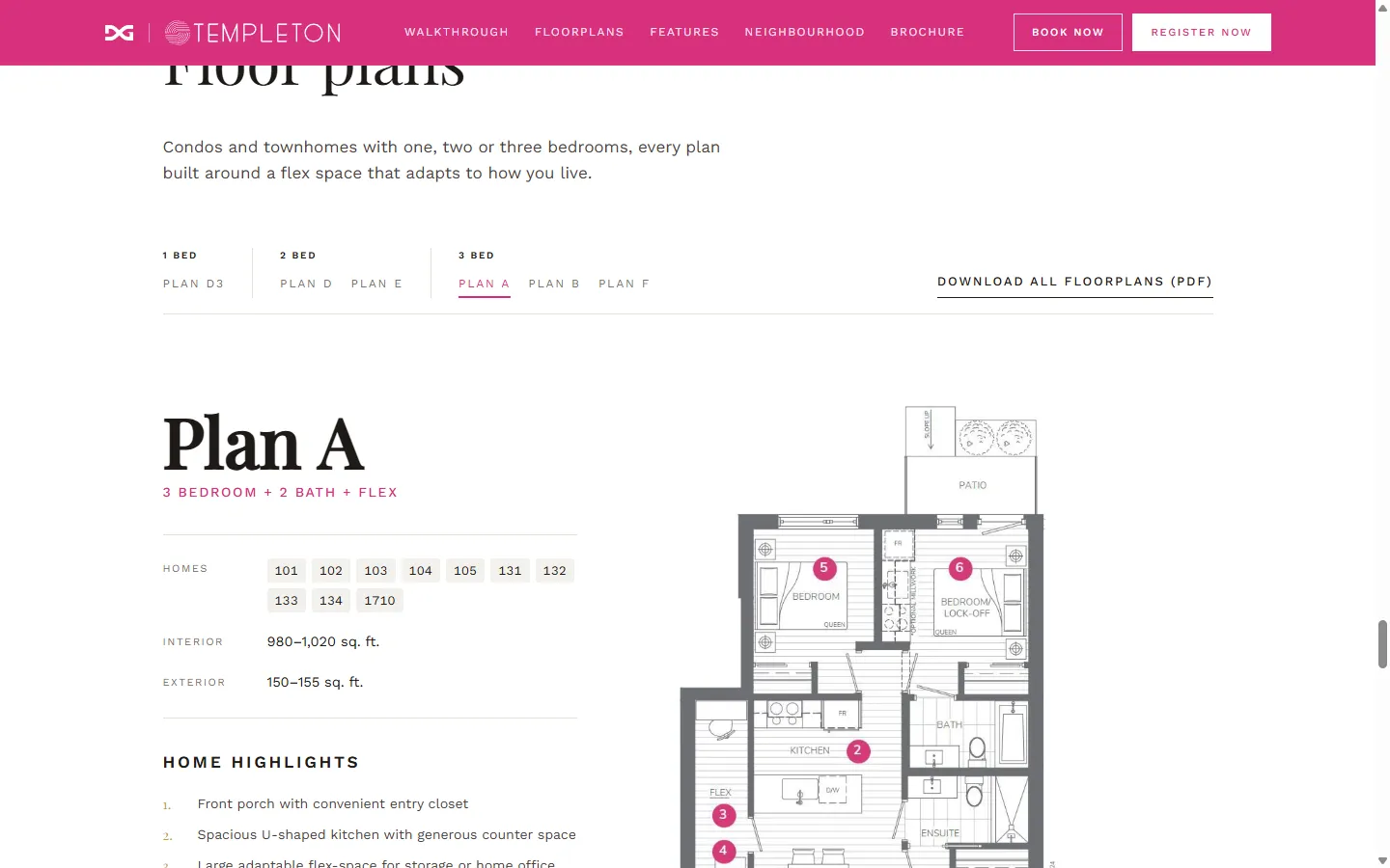
We also worked through the rest of the page the same way. We tightened the UX on the floor-plan filter, so a buyer narrows to one, two, or three bedrooms and sees only the plans that fit. The neighbourhood map and its directory of nearby restaurants, cafés, schools, and parks were redrawn to match. And the Passive House engineering is laid out so it reads as a selling point rather than a footnote.
We built the site as a working prototype, then migrated it into Wix Studio at the client's request.
Results
The site finally matches the homes it sells. Side by side with the old one, the difference reads instantly: more modern, calmer, easier to follow, with the offer and the next step impossible to miss, and a phone experience that went from cramped to genuinely comfortable to use. And because the brochure and the site run on the same design system, they speak with one voice everywhere a buyer meets Templeton, from the printed page to the screen.