Templeton Living & Lakewood Living
One design system across a print brochure and the websites for two sibling Passive House developments in East Vancouver.
Client challenge
Link Brokerage, a marketing agency, hired us to redesign the sales brochure and both websites for Templeton and Lakewood, sibling Passive House developments by Dimex Group on East 1st Avenue in East Vancouver. Both had been selling for a couple of years, and not every floor plan was still available.
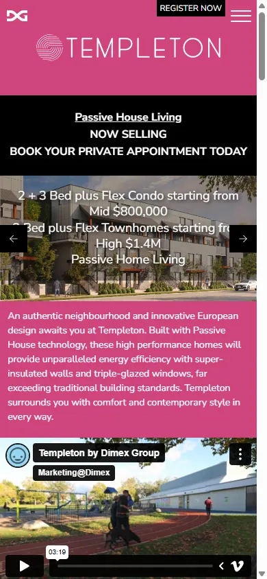
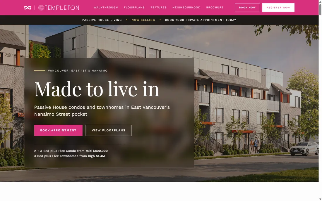
The two sites were near-identical, and both showed their age. Three stacked bars of branding and navigation ran before any content, and the Passive House engineering and the features sat inside a slider, several slides deep, with nothing on the page to say there was more behind it. On a phone the copy over the hero image ran into itself.
Our strategic approach
We designed one system for both the PDF brochure and the websites: a quieter language of type, spacing and layout, inside the logo and colours Dimex already had. The brochure came first, and the sites were built on it, so print and screen read as one thing.
Both properties were near the end of their sales run, so the sites had to present what was still available rather than the full catalogue, with booking an appointment as the one thing they ask for.
Templeton and Lakewood had to read as siblings without looking like copies: same bones, each with its own colour and personality.
Solution
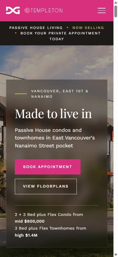
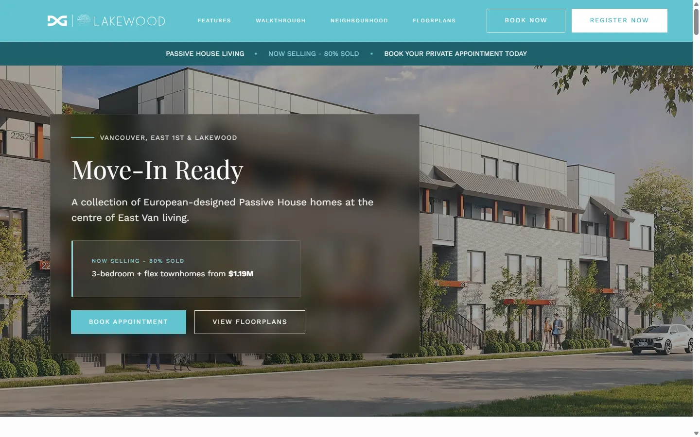
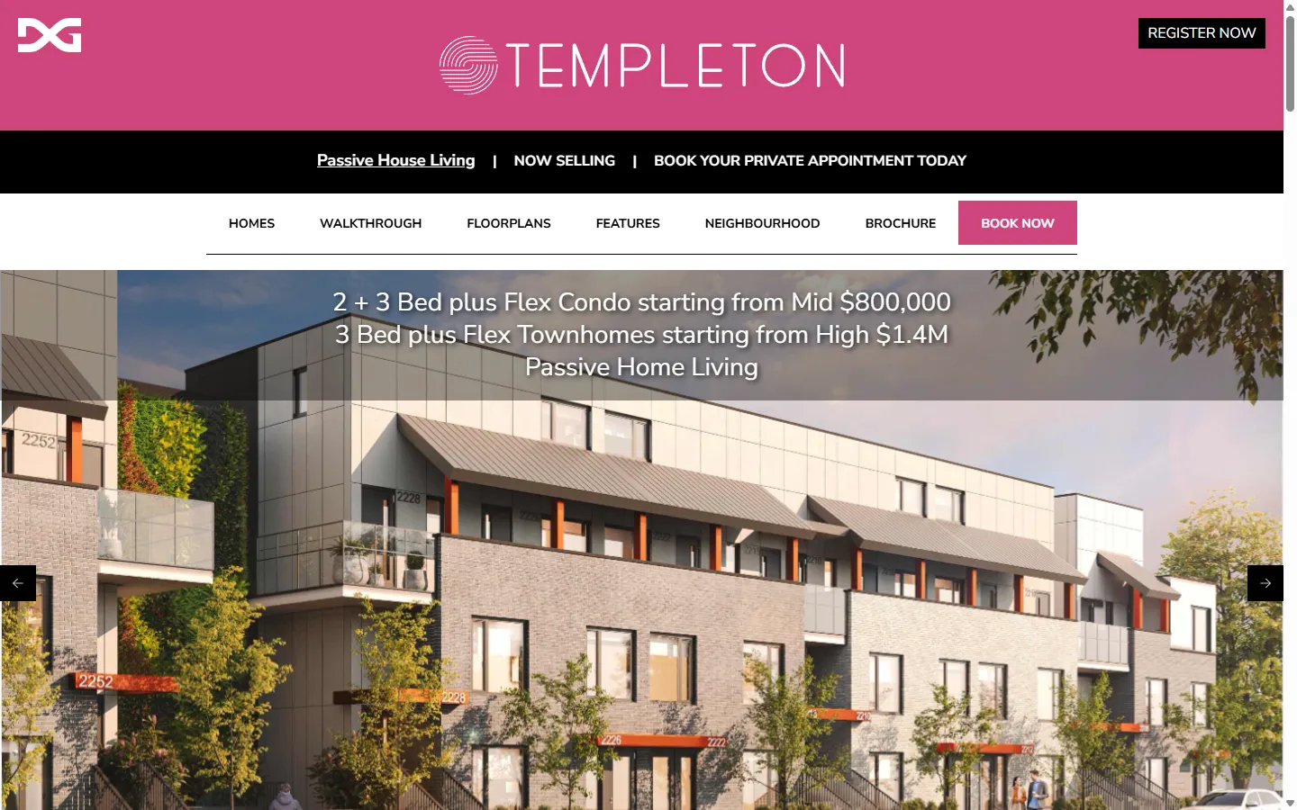
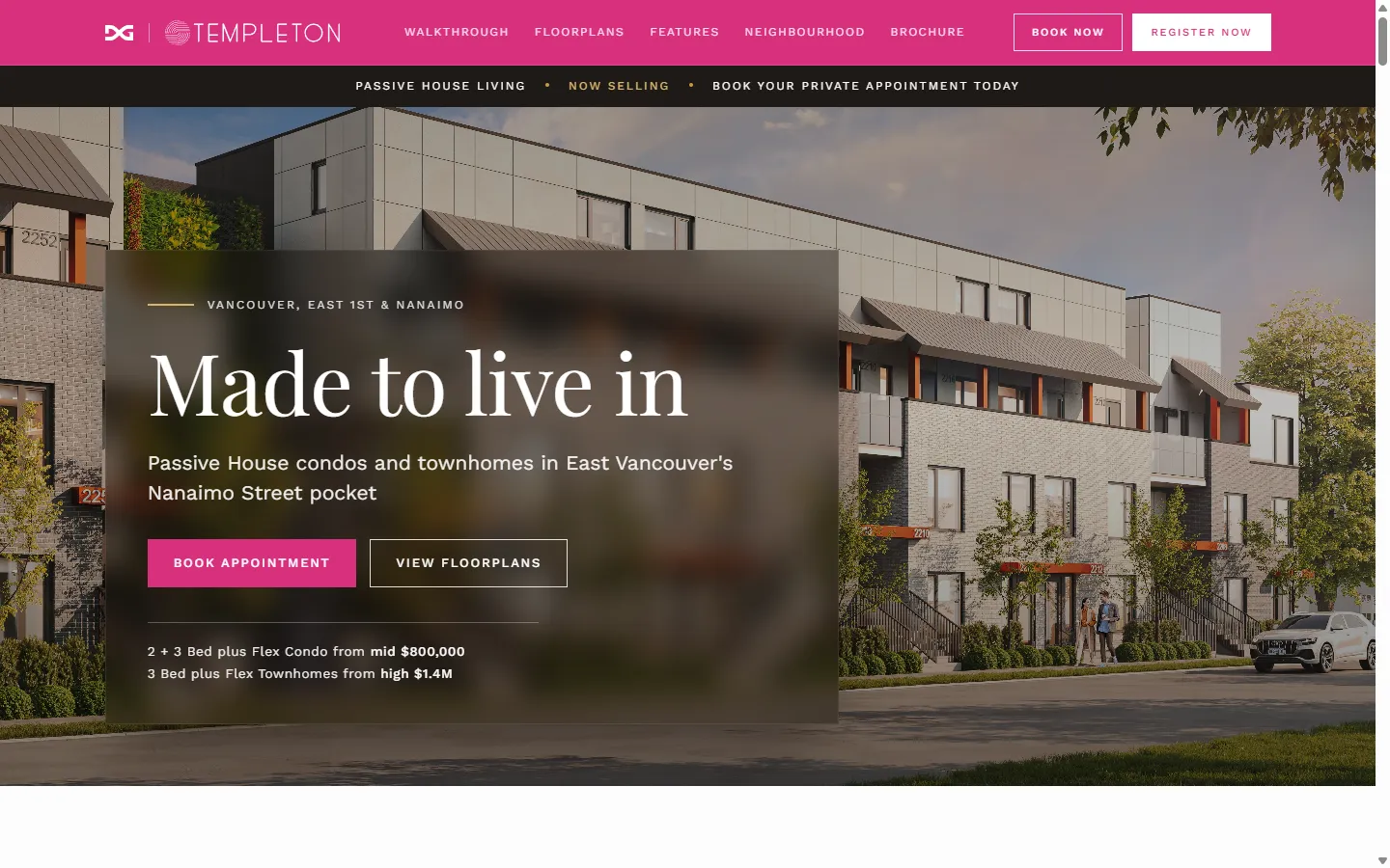
We rebuilt both homepages around the new system. The hero was cut back to the homes still for sale, their starting prices, and two buttons, book an appointment and view the floor plans, so what is left and how to see it are the only things on the first screen. Everything the old sites kept behind a slider is laid out down the page instead.
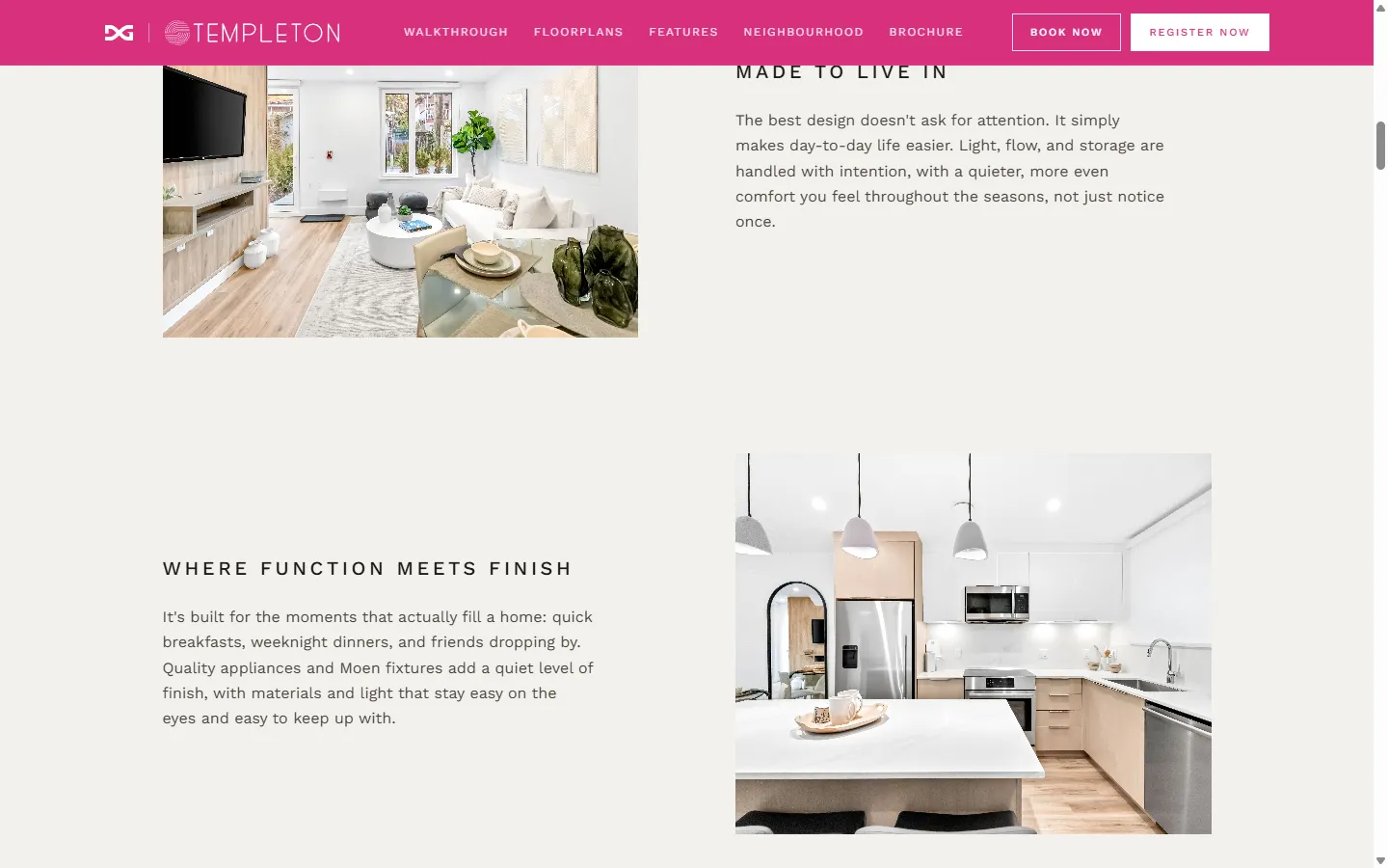
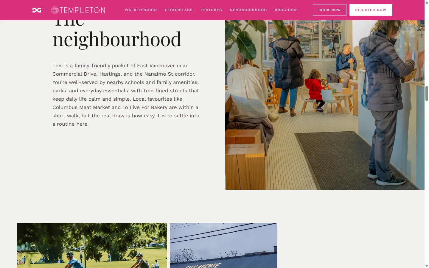
Link Brokerage asked us for a new typeface. A serif in the headlines takes the technical edge off a Passive House pitch, and the pages sit on a warm off-white rather than white for the same reason. Below the hero both sites go quiet, with enough room around the interior photography that a kitchen gets half the screen. The brand colour is held back to the header and the buttons, magenta on Templeton and teal on Lakewood, which is most of what tells the two apart.
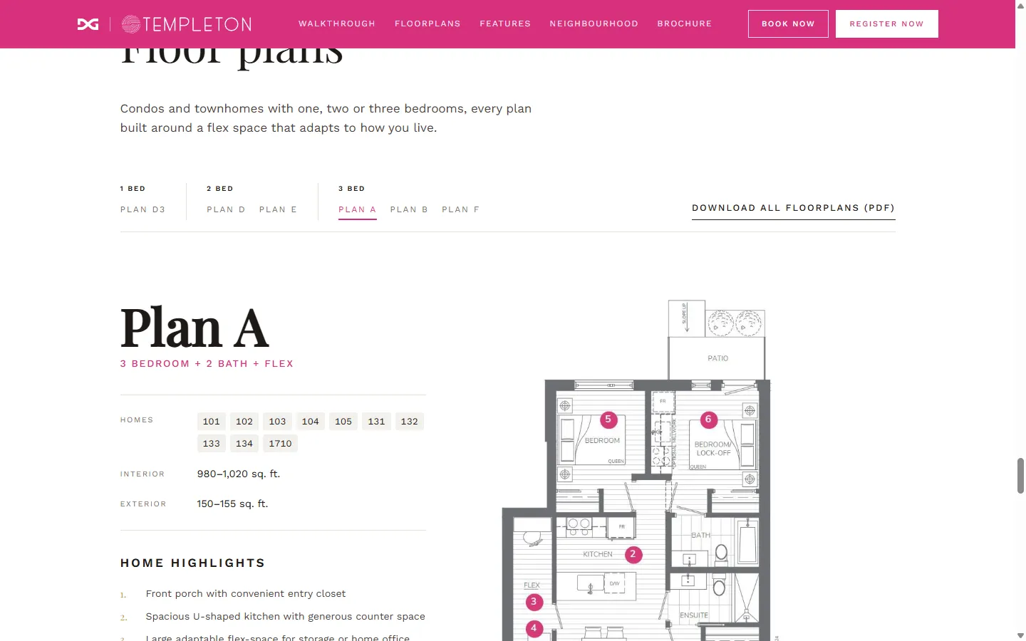
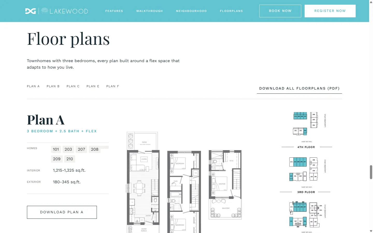
Templeton mixes condos and townhomes, so its plans keep a filter for one, two or three bedrooms. Lakewood is all three-bedroom townhomes, so its plans list straight out with no filter in the way.
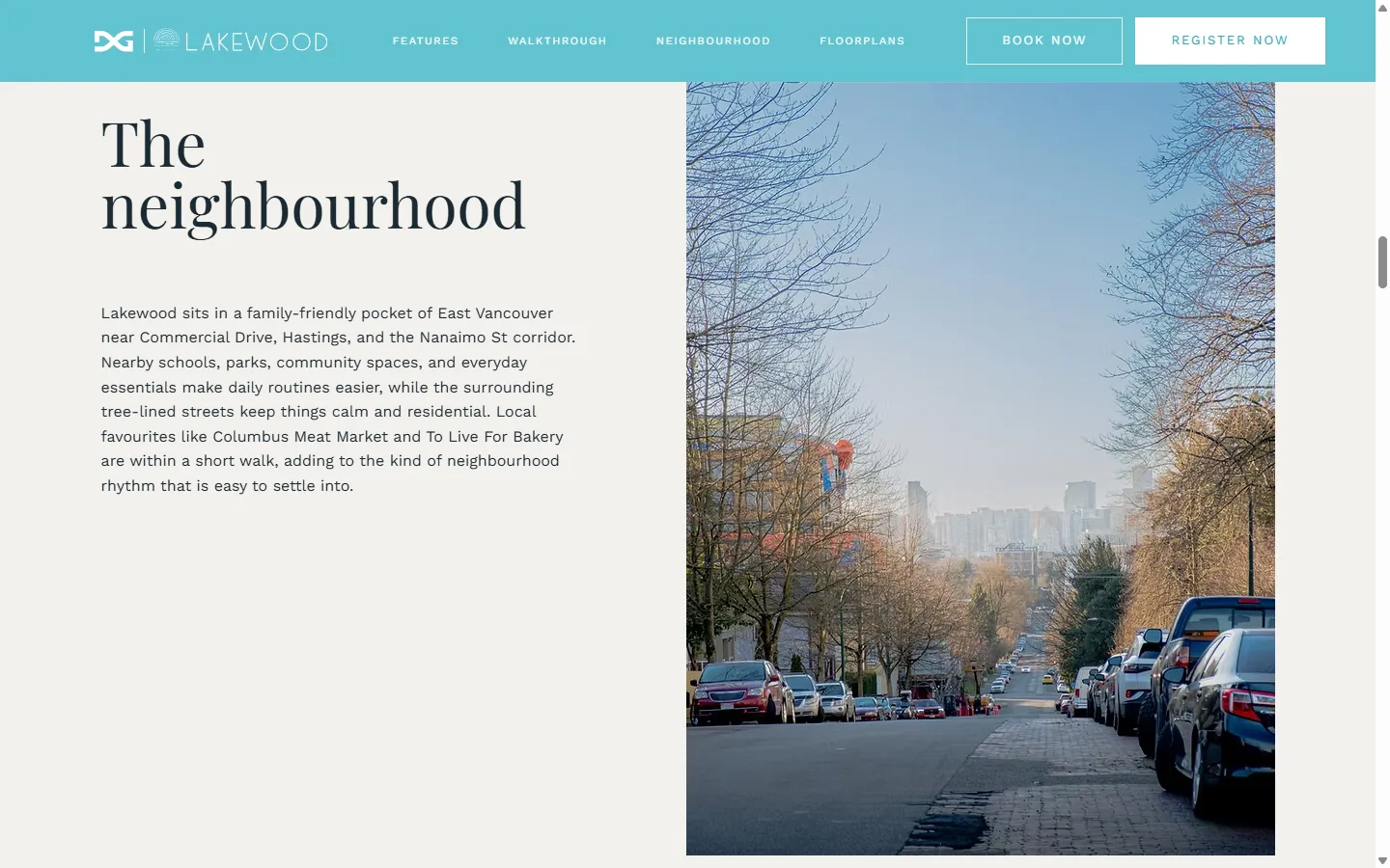
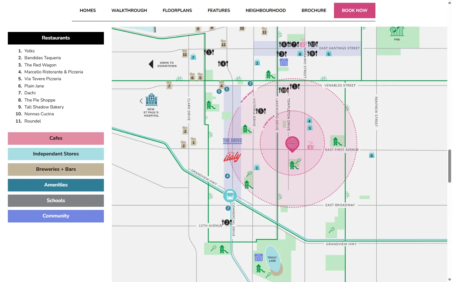
We redrew the neighbourhood maps, simplified from the originals so the map and its list of what is nearby read at a glance. The client wanted to edit the pages themselves, so we built both sites as prototypes and rebuilt them in Wix Studio.